Worst Websites of 2008 Old School #6-10
There's good web design and there's bad web design and then there's Old School web design. If you go to a website and it looks like a website you saw back in 1995 through 1997, then you're looking at Old School web design. Professional web design companies do not create Old School websites.
It's "interesting" web design
Sites that use Old School web design make a variant of Mistake #5 from Biggest Mistakes in Web Design 1995-2015 — Have you looked at a website since 1997? Really? Doesn't look like it."
Often these sites also suffer from "WTF Syndrome." You look at the site and mutter, "What the heck were they thinking?"
6. Tracy's Karate

It's a YAITS (Yet Another Industry That Sucks) — Martial Arts websites. A blast from the past is Seneca Tae Kwon Do.
It's a mess. Ditch the site and redesign it.
Vincent Flanders' comments: This site is an archetypically bad martial arts site. You have to love the "put everything on one page" mentality. Because there is so much text, I didn't notice the "Click here for a simple navigation page" link. Duh. Why isn't this the home page and the current home page a link called, "Click here for a stupidly complex non-navigational page."
The Splash/Home page, with the TITLE tag "Home," enjoys multiple text sizes, multiple text colors, and centered text. The "real" home page likes color. Lots and lots of color. Some of the subpages (FAQ) are missing images.
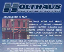
7. Holthaus Signs
Looks like somebody had a brochure lying around and said, "Hey, we'll just scan the brochure and make a website!" C’mon. This is soooo 1997.They use image maps throughout the site.
Other comments #1: They should use this tool to image map their page http://www.image-maps.com. It will center the text links right under the image map.
Other comments #2: Aside from the fact that this is yet another sad example of "navigation," they can't even be consistent with their menu.
Some of the pages are 404 from certain pages, while you can then find it from another page. For example, try to go the pylon page from the home page…fail. Now find a link that does work and then you can get to the pylon page. Gotta love hard-coding menus on each and every page. I love sites that are a maintenance nightmare.
8. Poor David's Pub
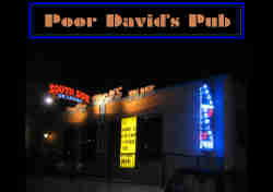
A lot of pubs still have this 1997 look and I don't understand why. My favorite section in today's site is Upcoming Shows, which features a set of animated, rainbow divider bars so out there that even gay bars won't use them on their websites. The same goes for the multicolored text.
I personally hate calendars that aren't up-to-date and this site's is certainly not current. I've noticed a lot of rock bands actually keep their calendars up-to-date (the Gin Blossoms come to mind).
Other comments: This website dates back to the Art Deco Style of the 1920s with the neon colors on a black night background. I found the soft glow of neon somehow comforting and alluring as a child but that was a long time ago. The site could be repaired by using just a few well-filled pages with flush-left font. They should retain the colors but resize the pages to display at 1024x768 on a 17" monitor. The website calendar must have been updated since the site was posted as it seems up to date.
9. DRM Guide to Disability Resources on the Internet
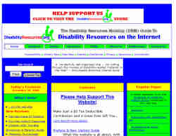
Submitter’s comments: Irony of ironies: a disabilities website that is spectacularly ill-suited for people with vision problems like color blindness. (Warning: If you are not blind now, you will be after viewing the site. Wear welding goggles.)
Vincent Flanders’ comments: Well, actually, it isn’t “spectacularly ill-suited for people with vision problems like color blindness,” it’s just butt-ugly. I ran the home page against Visicheck’s color blindness simulator for both deuteronope and protanope color blindness and then checked the results against AccessColor for contrast issues and discovered:
4.68% failure for both color difference and color brightness for deuteronopic color blindness
3.28% failure for both color difference and color brightness for protanopic color blindness
0.00% for the regular website.
On the other hand, either color difference or color brightness does not meet the recommended standard for 6.56% of the total the text for the regular site. The deuteronope version’s failure rate was 3.51% and the protanope version was 0.47%.
The text is also tiny, but you can resize it by typing CTRL+ but the colors are soooo horrid.
10. Sail New York City
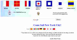
Ouch, it's too gaudy and way too long. Can we put any more on a web page? I especially love the subpages like What to Bring with its gaudy, unmoving background image. It's a car wreck.
Other comments #1: Within 30 seconds I started to feel a little queasy. Then I noticed 6 or 7 different font colors and styles on the first screen — what a great way to slow down comprehension of a page. Next, I noticed that the page needed side scrolling, meaning it was probably built on a 20" display. What's with the damned ping-pong screensaver, did they steal that off a Commodore 64? Oh yeah, don't be stealing any images off this site. Everything is centered so nicely on that huge canvas of white space, makes you want to scroll forever. Wow, an AOL email address and Google Ads. What a mess!
Other comments #2: Just love all the things that scroll by and move back and forth. So soothing. NOT. Scrolling marquees went out in 1999. Please join us in the 21st century.
Page 2 of 2 Previous: Worst Old School #1 to 5