The 10 Worst Websites to Navigate in 2006

Note: The worst form of bad navigation is Mystery Meat Navigation and 2006 saw some incredibly bad examples.
Don't forget to read The 10 Worst websites of 2006.
As a now-defunct article once stated:
Mystery meat navigation (also abbreviated MMN) is a term coined and popularized by author and usability analyst Vincent Flanders to describe user interfaces (especially in websites) in which it is inordinately difficult for users to discern the destinations of navigational hyperlinks — or, in severe cases, even to determine where the hyperlinks are. The typical form of MMN is represented by menus composed of unrevealing icons that are replaced with explicative text only when the mouse cursor hovers over them.
Flanders adopted the epithet mystery meat because, like the unidentifiable processed meat products historically served in many American public school cafeterias, MMN is unfathomable to the casual observer. Before conceiving the term mystery meat navigation, Flanders temporarily described the phenomenon as Saturnic navigation, a phrase named for the Saturn Corporation, whose website formerly served as a high-profile example of this web usability problem.
Here are the worst websites to navigate in 2006:
10. Diners Club
(They've fixed it. See Below.)
Strange old school MMN circa 1997. Here's a big company using <gasp> animated GIF images. You have to wonder about the four doors. You would think they would match the navigation buttons at the top. Nope. The bottom-right door is about "News and Resources," while there is no corresponding door to the "Corporate Solutions" button.
They've fixed it.
Well, the good news is they've fixed the page in question. The bad news (for them) is the web has archive.org so that you can't really hide your past mistakes.
You can see the mistakes — at SmugMug or YouTube (click on video below).

Diners Club Current, fixed site.
9. Shulman Fleming

A grand exercise in Flashturbation, this one features MMN and a pixilated picture of their graphics designer on the home page! I especially like the effect one finds when moving the mouse through the white box in the "Services" section. The baby image makes no sense.
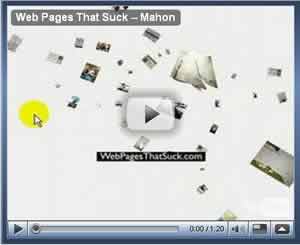
8. Mathew Mahon
Upside down and sideways text. It didn't take me long to not read that. I hope it wasn't important. I found a phone number and cell phone in a few places where, thankfully, they read left to right, in English and right side up. However, the rest of the site gave me no reason to want to call him. I don't even know what his specialties are, although later I found it to be portraits. At least I think so.
The charming YouTube movie version follows.
7. Campbell Mithun

When I read the email, my first reaction was, "Crud. They do web design and I can't use them." Nevertheless, I moused over each and every pill and nothing said web design.
OK, if they offer web design services, Google doesn't know about it — which may be all the proof you need that as far as Search Engine Optimization goes, Flash sucks. If I can't find it and if Google can't find it, then it certainly is proof to me that they don't offer web design services.
6. M E D I U M

What is it with architectural firms? It seems every other one is using MMN on their site. There's also very little contrast between text/links and the background. To paraphrase a great quote, "If programmers built software like web designers build architectural websites, Bill Gates would have ended up a lawyer in his daddy's firm."
5. sjb

I spent a long time trying to grasp how the navigation was designed to work. Further, even once I saw how it worked, I still found it frustrating to use.
Pushing the envelope for navigation design is one thing, but this approach is so literally counter-intuitive it's uncomfortable even when you understand it. You're asking the user to interact with one button-type area of the screen while looking at another area to see the response. Eye/hand coordination aside, it didn't even strike me as particularly interesting.
4. ushida findlay architects

I didn't even know what these folks did for a living until I belatedly looked at the TITLE tag. I should have known. What's the deal with architects? They seem to love the stupidity that's MMN. The #6 spot in this list is and architectural firm ( M E D I U M) and another architectural firm I've used in the past is Torchia. My question is simple. In the buildings they design do you have to guess where the rooms are located?
Sometime during the past five years, they've fixed the site. Well, sort of. There are contrast issues. Fortunately, Archive.org has stored a copy of the site in all its "glory."
ushida findlay architects (current site)
ushida findlay architects (old site stored at Archive.org)
3. Gaia Group

Last century — the summer of 1996, to be exact — I remember a co-worker saying, "Come here, Vincent. I've found the most awful, degrading, dehumanizing website on the Internet." I went over and looked at the site and said, "You're right, but only for today. It always gets worse."
Originally, I thought this site may very well have the worst MMN on the web. But since this site came in at only #3, it's obvious we've got at least two sites which are worse.
I think of myself as logical and I think most people are logical, but who in the name of all that's holy signed off on this website?
2. Crumpler Bags
I'd tell you to just go there, but they've fixed the site. I mean, it's 2012 (as I write this), so it has to have changed. Click the YouTube video below to see how horrible it once was.
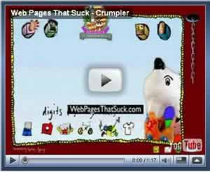
This is a higher-quality version of the video. (SmugMug)
I didn't provide commentary for this or any other site because I believed all these examples were all self-explanatory. However, I received a dissenting email on July 9, 2007, and I'd thought I'd include it and some of the many emails I received which explain why this site's navigation sucks:
I'd like to mention that some of these suggestions were for the Australian version of Crumpler Bags which, to me, looks like the American version.
Here's the email that caused me to put up this commentary:
Hi,
Why on earth did your website rate the Crumpler website as the 2nd worst of 2006. I would like a good explanation. It is a great website, it isn't supposed to be a professional corporate site. It fulfills it's obviously intended purpose as a fun site for people like uni-students who want to buy bags.
Well I rated it as the #2 site for Navigation. More people have suggested this site than about any other I've featured (except Chipotle — who have modified their site). Here are just some of the comments:
From 2006 (#3):
I would like to nominate Crumpler Bags as the worst website design of all time.
I went there to find out about their products, but after visiting the website, I'm convinced they all must be such utter jerks I'd never do business with them.
Everything that could possibly be wrong with a website is wrong with this one. Seriously. It's so bad I can't even come up with words to describe how terrible it truly is. If you designed a website with the specific goal of making it so obnoxious that it drove people away, and with the secondary goal of making it maximally difficult to clean even the smallest iota of information about the products from the website, this is the design you'd come up with.
It's really, really, REALLY bad.
From 2007 (#1):
Hey Vincent, you missed the best (worst) part of the Crumpler bag website. See that chain hanging down to the right? Well, if you hold you mouse and drag on it, you are rewarded????? with the sound of a flushing toilet. OK, it's supposed to be kitschy, but that's wayyyyyy over the top.
From 2007 (#2):
Thank you for including Crumpler's site (in the '06 worst nav awards). I like their bags, and would like to recommend them to friends, but their site is so awful that I really can't. The last time I looked, they had their print catalog available for download (.PDF) and it could also win print design awards for awfulness. Anyway, I've long maintained that theirs was one of the worst sites out there, and it's nice to see some confirmation.
From 2004:
Let me see.... how can I explain this site....... Um..... Sound, flash, Mystery Meat Navigation. Oh, and the best part is the nards. Well.. I don't know what else I can say except this is a perfect page for your site.
From 2005 (#1):
I was at a UI conference last year where a web application at Crumpler bags was demonstrated as a good example of design (very good use of Flash where you could create the bag of you dreams in front of you then order it). I didn't see much of their website back then so I didn't know what it was like.
I just visited the site for the first time and it is astonishingly bad. I went in with a really positive attitude towards the site and it started out OK. I like the use of the multiple "Loading" messages as you are waiting for the Flash to load — mind you I usually HATE hitting a Flash loading page as soon as I get to a website, but this time I knew that the use of Flash was useful (or thought I did) so I was more patient.
Then the experience goes seriously downhill. I am on a dial-up line. When the next screen came up I thought everything had finished loading and tried to navigate through the seriously Mystery Meat Navigation! Strange things happen but no catalog which is what I am looking for! I then find the catalog (purely by accident) and the display of their bags is too small and the whole thing is difficult to navigate — it just sucks! Looks like they have had a re-design!
I really can't believe how badly the design company stuffed up on the usability here. I was prepared for a bit of MMN, a bit of craziness, but this experience was just appalling.
And don't get me started on the looping song that I can't stop...
From 2005 (#2):
Crumpler used to have a very nice, hip, easy-to-navigate website But then for some reason beyond comprehension they switched to that bizarre confusing piece of $%^& it is now.
From 2005 (#3):
I'm not one to complain often about website usability design (I pretty much assume all artsy websites have bad usability), but I found one I couldn't help submitting to the Daily Sucker. I visited Crumpler Bags looking for a sleeve for my 12" PowerBook, and came away with nothing — not even a glimpse of a single bag.
I entered the website to find a Flash page loading, which I have become cautiously optimistic about lately (web designers have discovered that people still want to be able to use navigation so most of them have it built-in).
After the site loaded, I followed the instructions ("Click and drag for the bags") and nothing happened... I clicked on a few different things and finally I found myself staring at a blue-to-white gradient backdrop with trippy little nonsensical hand-rendered drawings of random objects floating all over the place. In the background played some equally absurd tune that I finally figured out how to shut up.
Along the top, there are four icons that don't give you half a clue as to their meanings. The whole drag-and-drop thing might work better if it said where to drop the objects, but instead I had to figure out for myself that I needed to drop them on the weird disappearing hand sticking out from the side of the "frame". All of the objects were a total let-down; I never actually saw a bag on their website
To this website, I say "boo." I get what they were going for, but the execution was a disaster.
From 2006 (#1):
This site was recommended as a good place to go for laptop bags. I never got as far as seeing any laptop bags: the site was just too horrible. Can you work out how to make the links on the links page work? First you have to work out which is the link to the links page...
From 2006 (#2):
I've been checking on WPTS for a couple years. I recently brought up “Mystery Meat Navigation” to my senior project group as we were discussing the design for the Flash website we have to create.
One of my group members sent me a link to Crumpler Bags. Mystery Meat Navigation abounds. No clue where the top buttons lead to and the user needs to literally move stuff out of the way to get to links that give any sort of hint where they leave. If you owned a store, would you put a giant cartoon cutout in front of your door and make people move it out of the way to enter? Not to mention bad music (at least you can disable it), and scatological humor (press the button) that just obscures the site.
Crumpler Bags (Current, fixed site)
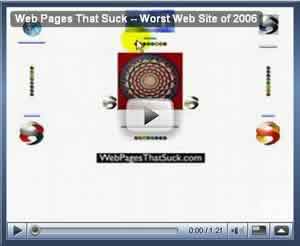
1. Optimal World
The Overall Winner Is now just a parked domain with ads.
Well, I just happened to have the movie version. Doesn't the worst site of 2006 deserve to be captured for posterity?
The Wayback Machine also has some of the pages.
It's self-explanatory and it's a double-win. Optimal World wins worst MMN and it was #1 on The 10 Worst Web Design Techniques Featured on Web Pages That Suck in 2006.
Optimal World (Just a parked domain.)